Microcopy is a little-appreciated aspect of web copy. But, it can make the difference between a conversion and a lead getting lost.
Microcopy increases click-through rate. It boosts engagement and provides a better user experience.
In short: small words matter.
Why? Because people read less than 20% of a website’s content. We want a short and simple line that tells us everything they need to know at that moment.
What is Microcopy?
Microcopy is a short sentence or word that helps the user do something. Examples of Microcopy include “call to action” text, button text and the feedback you get when you fill out a form incorrectly.
For digital marketers, microcopy is an essential part of conversion rate optimisation (CRO). You need to combine powerful, compelling copy to the user that is clear but doesn’t bog them down.
The last thing you want it to have a customer turn away because they couldn’t navigate your online form.
Think about the forms on your website
Are they clear enough for the average customer? If your form isn’t filled in correctly, what happens? Do you display a clear instruction?
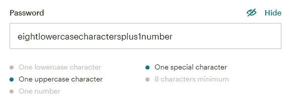
You can also use microcopy to anticipate and avoid common user mistakes. Mailchimp’s password field uses microcopy to make sure you’re creating a secure password.

As you meet each requirement, it is greyed out. You know exactly what type of password you need to create before you write it.
The result? More secure passwords for Mailchimp, which helps them and their users. This, in turn, tells the user that Mailchimp is a brand that cares about its customers’ security.
It also gives the user confidence that Mailchimp provides a secure and trustworthy service. Microcopy can also be used to help your customers correct their course when things do go wrong.

Certain form fields can trip users up more than others. It always pays to identify these fields through testing and analytics. Once you have identified problem areas, the use of copy can often solve the problem without having to compromise on the design.
Why does microcopy matter?
Microcopy matters because it can have a huge impact on your conversion rates. Offering your customers what they want, rather than what you think they want can improve conversion rates by over 100%.
Veeam conducted a survey for user feedback on their lead generation form. They found that many visitors wanted to know the price of their services. They decided to change the phrase from “Request a quote” to “Request pricing”.
Before…

After…

When they measured results with an A/B test, they saw an increase of 166.66% in conversions.
Microcopy gives you a chance to add that human touch
Use microcopy to give your customers the feeling that you’ve got everything under control. By using a conversational tone, users feel safe.
If something goes wrong, there’s an actual person out there on the other side ready to help them out. Put yourself in the shoes of a user and ask yourself: which sounds better?
“Username not found. Please try again.”
“We can’t seem to find your Username, can we help you recover it?”
Small touches like this are hard to quantify in terms of conversion. But they create positive and comforting feelings in the customer as they make their way along their conversion journey.
Microcopy helps build trust
People get hacked every day and cybersecurity is a high concern to consumers than ever before. We’re all scared of hackers, but we love the convenience that comes with online orders and next-day delivery.
For smaller businesses and lesser-known brands, convincing people to hand over their precious data can be a challenge.
Fortunately, microcopy can play a major role in making building trust and making people feel like they’re in safe hands.
A study by Baymard Institute revealed that adding a bit of microcopy explaining why you need personal information can make a huge difference in how people feel about handing it over.
For forms on Contact Us pages, this can inject a huge boost of trust in your potential customers.
The introduction of GDPR has made people wary of handing over their email addresses. They don’t want to be added to the dreaded Marketing Subscriber List.
Reminding your users that you will only use the information they give you in relation to their enquiry, you alleviate that fear and remove some of their hesitations to convert.
This type of microcopy will help customers feel like you care about them and respect them. If you take the time to offer an explanation, you can make the difference between a conversion and an abandoned page.
How to use microcopy effectively
The Golden Rules of Microcopy
- Be concise
- Reassure, don’t blame
- When in doubt, spell it out
- Be authentic
- Provide context
- Never, EVER use jargon. Ever.
If you’re giving people instructions, be clear and concise.
For error messages, always tell the user what’s wrong and how to fix it.
Instead of ‘Your form contains errors. Please rectify and resubmit‘ use ‘Seems like that credit card number is too short’.
Avoid using “Submit”. Submitting makes you feel vulnerable and it doesn’t tell you anything about what’s going to happen next. All you can be sure of is that it’s out of your control.
Talk to your user like a person. Have a conversation and convey technical information in simple terms. Whenever possible, avoid making each step of the process sound more difficult than it is.
Context
Where is your microcopy appearing? If you have instructions that refer to a specific field or section, make sure it is clearly indicated. If you want to guide your user through a process, put your copy in-situ. This will give the user a visual reference for what to do.
For example, pre-populating a field like this makes it clear to a user what that field is for.

Action
What do you want your user to do? What will happen when they do it? Use action verbs in your microcopy to encourage and provide clarity.
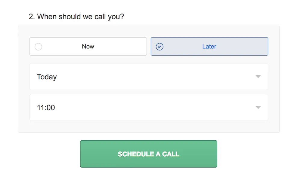
The example below from Toptal tells you what will happen when you fill in the form – a call is scheduled. If the button simply says “submit”, you don’t really know what you’re getting or what happens next.
You have the right to know what you’re signing up for. Microcopy makes sure that you do by alleviates all types of customer concerns.

Confidence
Microcopy should make users feel confident and safe. If you’re taking people’s data, reassure them that you’re being GDPR compliant.
Instil trust by reminding them that they won’t be bombarded by marketing emails. Encourage conversion by offering “no-obligation quotes” and that there’s “no credit card required”.
A/B testing microcopy
Looking at how customers use your website, studying the conversion rate and then testing small incremental changes is a great way to approach design in general.
But most of the time, you’ll find that changing the words will have a bigger impact than redesigning the whole page. A/B testing your microcopy will help you identify the sort of language that converts your audience.
This can also help you develop your brand’s tone of voice. If your customers resonate with specific words or turns of phrase, consider rolling them out across your wider marketing.
7 great microcopy examples
Here are a few examples of great microcopy, along with the reasons why they’re great.
1. “Get a no-obligation quote.”
When you’re shopping for a quote, you don’t want to have to commit to the first business you find. Reassure your leads that talking to you doesn’t mean locking themselves into an obligation.
2. “No credit card required.”
Simple, elegant and effective. This line is often the clincher that encourages people to give you a go. The subtext here says “no commitment, no worries”.
3. “We’ll only use this information to answer your enquiry.”
We live in a world of GDPR and fears of an inbox full of spam. This simple line reassures users that their data is safe. It also hints towards what’s going to happen next: someone is going to look at your information and answer your enquiry.
4. “You can always change it later.”
Signing up for a new account can put a huge barrier between your lead and a conversion. This microcopy reassures users that they don’t have to make all of their decisions right away. They can update or change details at any time.
5. “A member of the team will contact you within 24 hours.”
You’ve filled out a form that says “Get in touch” or “Request a quote”. What happens next? This piece of microcopy tells you exactly what’s going to happen next and provides a timeframe. This helps you feel more in control of the process.
6. “Download my FREE eBook”
“Where’s my free eBook? Oh, there it is!” This microcopy looks best on a button. The use of the first person gives the user ownership and a sense of control. As a button, you know what’s going to happen when you push it: you get a free eBook.
7. “We can’t seem to find your Username, can we help you recover it?”
This type of microcopy is great for more complex forms. The use of “we” says to the user “it’s okay, it’s not your fault”. Then, the helpful suggestion resolves the issue, making the process as smooth as possible.
Don’t lose your voice
41% of people feel that brand consistency is key to influencing loyalty. Keep your users aware of what’s happening, but do it in a way that conveys your tone of voice.
The best microcopy works organically with your brand identity, providing a seamless onsite experience. Providing users informative, useful and entertaining content can ensure a better user experience.
Think about microcopy as a conversation with your users. It helps them take the right action, answers their questions, and gives them feedback.
Boost conversion rates with great microcopy
If you’re struggling to get your customers over the line to conversion, the answer might be the words you use. Poorly-tested or non-existent microcopy can be a deal breaker to your bottom line.
If your site is a leading driver for conversions, you can’t afford to ignore the little details that convince visitors and guide them along their sale journey.
Our conversion rate optimisation services can help you identify the strengths and weaknesses in your conversion process. We can help you get more leads over the line, so get in touch today.


