Pay-per-click (PPC) advertising can be hugely successful for your business, but to make it work as hard as possible, numerous components need to be rock solid.
PPC landing pages are used in paid search or paid social ads to provide a customised experience relevant to the campaign messaging that the person clicked on. A good PPC landing page should drive conversions with minimal distractions, whether primary or secondary and show your brand off to a newcomer.
As well as having a clear strategy, a spend that meets your goals, and a strong offering, your landing page is a key component of a successful PPC campaign. So, what best practices should you follow to create the ultimate landing page for your campaign? Let’s take a look.
1. Match the landing page to the ad and campaign
As you would with SEO and organic search intent, with a PPC landing page, you need to make sure your landing page meets the expectations set by the ad and wider campaign.
For example, a person searching for “analytics services” isn’t going to want a landing page dedicated to Google Analytics Setup, they’ll want something more tailored to an analytics service that provides monitoring and/or reporting, including setup.
But, if you’re also targeting Google Analytics Setup as its own service, then there’s no harm in having a similar page dedicated exactly to that. Unlike SEO, for PPC landing pages you can have as many landing pages as you want with no worry of duplicate content or detriment on performance (as long as they’re no-indexed!)
With your landing page, remember to make sure they complement the ad and campaign you’re running. There’s no harm in using old landing page templates, but if you’ve got bold and fresh creative that is disparate from your landing page, users will find it jarring and that conversion rate you were chasing will be long gone.
Like this one:

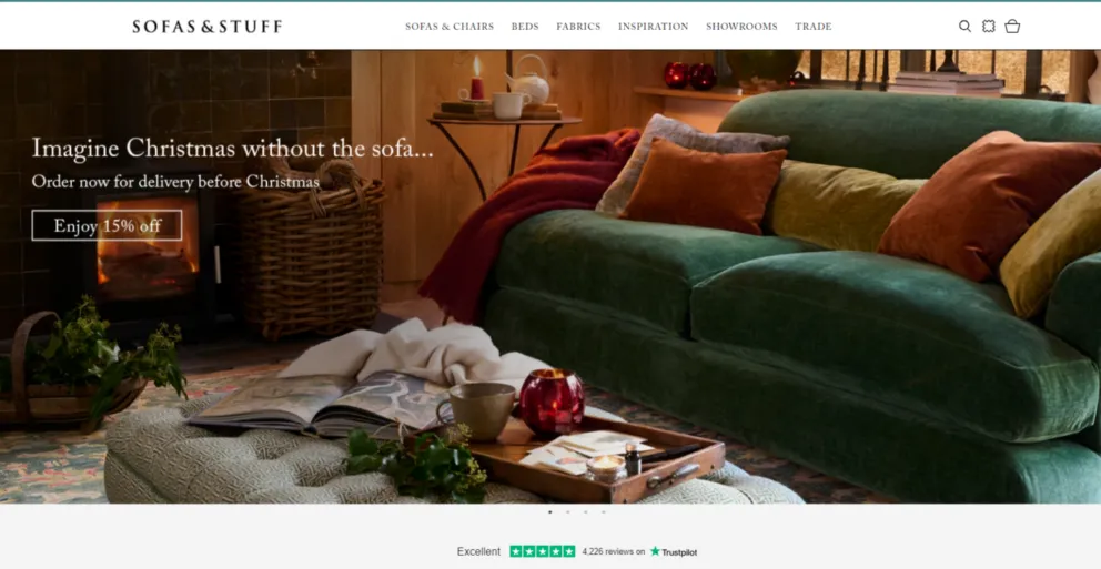
For example, you’ve got a landing page that you know converts, but for some ad creatives, you see a high rate of drop-off. Landing pages need to link back to the ad copy, so it makes sense as to why someone clicked through.
Say you promise 15% off all designs of your new t-shirt range, but someone clicks through, and it just goes to a generic shop page. This can be highly frustrating. For a customer, they would have to filter to show all t-shirts, find the new designs and see which have the 15% discount. What’s the likelihood that they’ll give up with their purchase? This lack of cohesion with the ad copy to the landing page is often the difference between making a sale or not.
2. Make users trust your expertise
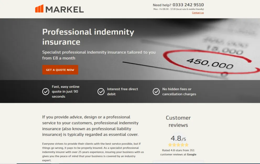
Trust signals are hugely important in any aspect of marketing, but at the first point of contact, such as a PPC landing page, they should be prominently displayed so customers know that your business is trustworthy and accredited by experts.
For example, if you own a construction business, your PPC landing page should include accreditations like the Federation of Master Builders, TrustMark, Checkatrade and similar, to show to your potential customers that you choose to demonstrate nationally recognised schemes. Link to a page on each trust factor that allows the user to verify what you’ve said, such as a company lookup. Trust signals can also be things like reviews from customers on any platform such as Trustpilot or Google.
Testimonials, if you have them, are also a great shout too! For both B2B and B2C, social proof like testimonials, quotes from satisfied customers and video can influence a consumer greatly. If you can use photography or videography that clearly demonstrates the benefits of your product or service, then you’ll be on to a winner.

3. Test landing page variants to get the best results
Split testing, or A/B testing, is hugely valuable for any marketing campaign, including PPC landing pages. With split testing, you’re able to try out different headings, images, or even layouts, to see what performs better. It’s best to split test on campaigns that are predicted to drive a good amount of traffic to your site, as otherwise the data can be too easily skewed.
Back in 2014, Google split-tested 50 shades of blue in advertising links in Gmail and Search to see which one drove the most clicks. This split test boosted the company revenue by an estimated $200m a year.
With split testing, you should always come up with a hypothesis first, then select a timeframe and a specific campaign and your control, before you begin the test. It’s similar to the science experiments you would have probably done at school like hot vs cold water and the effects on salt, except this time, it’s with data and paid advertising!
If you’ve not got huge swathes of data and traffic heading your way, then a big change like concept or presentation is going to give you better insight than smaller changes like button or text colour.
Create your initial landing page but then come up with a completely different concept for your variant. This should be based on how to appeal to or convert your user, one could use evocative language to sell and the other could be almost text-free, letting your product do all the talking.
CXL have loads of fantastic and detailed guides on how to A/B test, and if you’re starting as a beginner, this guide is one of our favourites.
4. Well-engineered CTA
CTAs (call to actions) aren’t as simple as BUY NOW, well, at least not 99% of the time. Instead, you’ll need to consider more tailored approaches and clever messaging. If the goal is to get your customers to click on your first CTA, you may need to sell yourselves a bit more first. You’ll also need to consider your campaign as part of your CTA. If it’s brand awareness, is a purchase lead CTA the right idea? Probably not! You’d instead want something like “Learn More” or “Discover what we can do.”
With your CTAs, consider not only the main action you want people to take but any other actions that could be positive for you. This could be reading a blog or other page, watching a video or getting in touch through a different method. You want to track your conversions, and you want your customers to have a meaningful experience on your site.
The other key elements to consider with your CTA are:
– Position on page
CTAs need to be correctly placed on a page. Traditionally, you may have a form near the top of the page for those who are ready to take the first step, but you also need ones further down the page at the right points to remind and encourage people to perform the desired action.
– Colour and contrast
Your brand guidelines may have already considered the colour of primary, secondary and even tertiary buttons, but have you considered their contrast against the background? And if you don’t have a predefined set of button styles to use, what will help you stand out from the crowd?
– Legibility
How easy is it to read the CTA you’ve just set up? Legibility of the font on every device as well as the size and letter spacing are key to a good CTA.
– Wording
Is the wording tailored to your brand, tone and is the link attached to the button?
– Copy (a CTA is not just a button!)
CTAs are more than just the button at the end of a block of text, the text itself is part of the CTA. How are you leading the person to click the button, or make that phone call? Language around the CTA should be persuasive and funnel the user to that final step.
5. Use unique images
If you offer any kind of business solutions, chances are you’ve probably seen some of the same stock images over and over. Whether it’s the classic office with a busy background shot, the person on the phone, or the manufactured video call, we’ve all seen them many times and chances are, your potential users have too.

We know that professional custom imagery isn’t possible for every person and company, but where possible, custom imagery can really add a lot of value to your landing page. If you’ve not got the budget to pay for a full photoshoot, then use what you’ve got. Phone cameras these days can produce surprisingly high-quality photos, and with a few adjustments on apps (if you don’t have an Adobe license), you can make quite the impact. This is especially true for ecommerce where lifestyle and product images demonstrate that your brand is not only legitimate but allows potential customers to see your product in situ.
If stock images are the route you go down, try and personalise them to an extent. Whether that’s adding branded elements on top or colour grading them all the same way, adding a ‘stamp’ on them helps to make them look less “stocky.”
6. Design for all devices
If you’re not creating responsive pages that work across all devices, you’re going to miss out on conversions. Ad campaigns of all kinds can be viewed on everything from a phone to a large display screen. You must consider and review how your landing page would look on any device.
Are your CTAs easy to click on any screen size? Is any text too small or too big? Do people need to scroll around the page horizontally to see all the text?
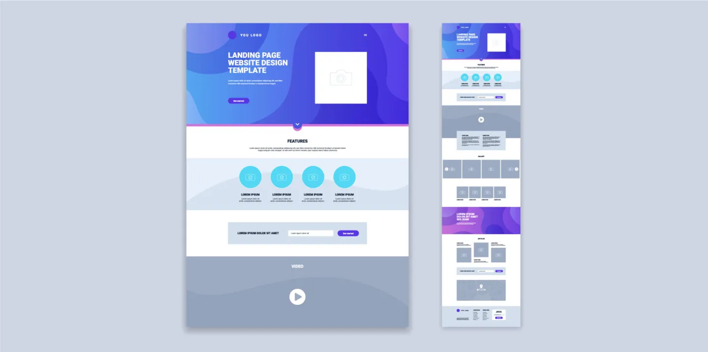
It’s good to get a variety of people to test on different devices to see what the experience is, and how they interact with it. You can also use platforms like BrowserStack to test, as they allow you a few clicks to see how your platform or website works across a huge variety of browsers and devices.
Platforms like WordPress are now responsive in their newer versions, but if you’re using an older version or have embeds on your site, then even a simple check on your own phone can help you spot any potential issues.
Specialist landing page builders like Unbounce also make designs responsive, which is a huge time saver!
7. Avoid distractions
We’ve written before about how pop-ups can be bad for SEO if they impact your user experience, and the same applies to PPC landing pages. Yes, your boss may have asked for a newsletter pop-up, chatbot message and a contact form pop-up after being on the page for two minutes, but unfortunately, that’s not necessarily going to help your conversions.
Try and avoid using interstitials such as pop-ups, unless the customer has clicked on a button that triggers one. This can help to keep the design of the page clean or provide a better experience for secondary CTAs.
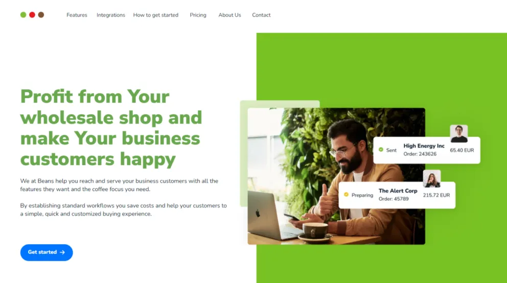
Some of the core things you’ll need to think about when it comes to reducing distractions on PPC landing pages are:
- Excessive navigation options
- Unrelated social media feeds or widgets
- Animated banners or flashy graphics
- Auto-playing videos or audio
- Pop-ups or interstitials
- Cluttered layout with too many elements
- Long blocks of text
- External links leading away from the page
- Complicated forms with unnecessary fields
- Slow-loading page elements
- Chatbots that appear without user prompting
- Overly complex infographics
Similarly, smaller distractions can also still be that difference between a conversion and no conversion. Unlike a pop-up, an internal link to another page isn’t right there in the user’s face – but it’s still there, nonetheless. This could be the distraction needed to take users out of the landing page journey they’re on.
Lastly, don’t forget about your website’s core navigation. On a PPC landing page, this shouldn’t always be necessary. You don’t want people going off to unrelated pages, instead, you need to keep them focused on the journey you have created on-page. Removing or heavily reducing your normal navigation on your PPC landing page will help to keep people focused.
Are you looking for an agency that creates winning landing pages?
Here at MRS, our content, PPC and design teams all come together to use their expertise to create PPC landing pages that perform. Why not get in touch today to see how we can help you?


