
What is the Google Page Experience update & when is it happening?
On the 28th May 2020, Google announced they will be releasing a new ranking algorithm coined the Google Page Experience update. And, from our perspective, it’s one you definitely want to pay attention to.
Google later announced that the Google Page Experience update will be put into place in May 2021.
Shape up or get left behind
Presenting users with a great page experience has always been important when it comes to online success – it’s nothing we haven’t heard before. In fact, Google has been telling us what we should be doing to improve users’ experience on websites for years. So, this algorithm update is Google’s way of telling webmasters it’s time to shape up or get left behind.
What does this mean for me?
The upcoming algorithm update means that page experience, from a technical point of view, is about to become a significant ranking factor. So, if your website isn’t meeting Google’s standards, you’ll likely notice a drop in visibility when the algorithm is released next year. This means less traffic, and ultimately, less leads and sales.
If your website isn’t meeting Google’s page experience benchmarks, your SEO will struggle to reach its full potential. Competitors that have taken page experience seriously are likely to outperform you in the search results. After all, why wouldn’t Google serve users a site that offers a seamless user experience over one that offers an average, or even poor one?
What Counts as ‘Page Experience’ Signals?
Google explains that page experience signals measure the different ways that users perceive the experience of a web page, beyond the content and information that’s included there.
This includes:
- ‘Core Web Vitals’
- Mobile friendliness
- Safe browsing
- HTTPS
- Intrusive interstitials
Core Web Vitals
Core Web Vitals are a set of metrics that measure user experience. They focus on speed, interactivity, and even visual stability of a website. These ‘vitals’ are imperative to provide a good user experience to those visiting your website.
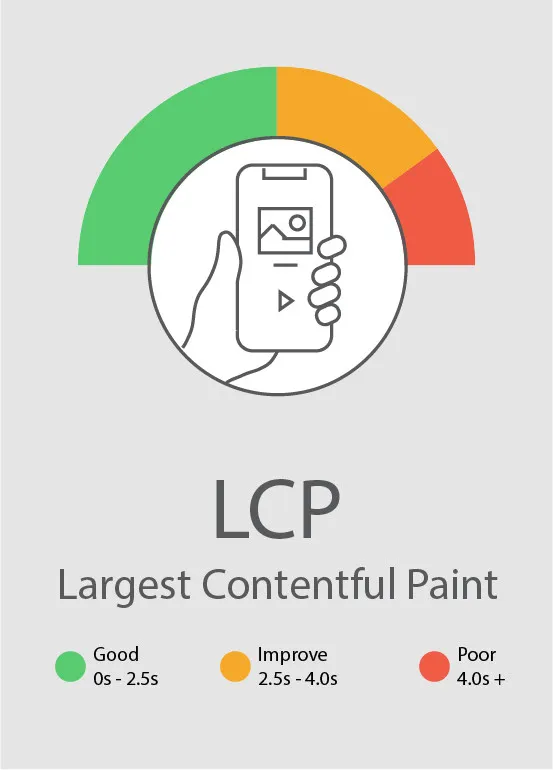
Largest Contentful Paint (LCP)
Put simply, Largest Contentful Paint (LCP) measures the time it takes for the largest content element on a page to become visible upon loading.
How do I measure site loading time?
When it comes to measuring how quickly the main content of a web page loads, the Largest Contentful Paint (LCP) is Google’s current recommended metric. This is recognised as being the most accurate way to measure a website’s loading performance, compared to other metrics like First Meaningful Paint (FMP) and Speed Index (SI).
What should you be aiming for?
Google recommends that sites should aim to have LCP occur within the first 2.5 seconds of a page starting to load.
Actionable tips*
- Reduce the size of the potential LCPs
- Load the LCP faster in the waterfall – reducing your time to first p (TTFP)
- Implement native lazy loading with JavaScript fallback
- Remove any unneeded assets and only load what you need to
- Encode elements properly and use compression via modern formats like WebP
- Ensure you’re using the correct tag attributes to load in elements such as src sets and sources
- Use correctly sized images more prominently
- Convert icons and simple graphics into vector SVGs and use in line rather than external resources
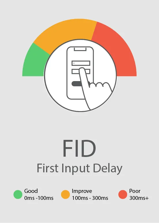
First Input Delay (FID) – Website Interactivity & Responsiveness
‘Did the wi-fi cut out or….?’, ‘You did click the button, didn’t you?’. When browsing, users want the reassurance that their actions are being responded to. First Input Delay (FID) measures the time between a user taking an action on a site (e.g. clicking a button) and the website responding (e.g. serving a page).
You can see why this could hinder user experience – imagine a long delay after clicking ‘Checkout’ on an e-commerce website. This can cause anxiety for users who are unsure if their transaction is going through.
How do I measure my website’s responsiveness?
Input delay occurs when the browser is still loading all or parts of a web page, so some parts cannot yet respond to the user’s interaction on site. First Input Delay (FID) is a metric used to measure a website’s interactivity and responsiveness when a user first interacts with a page on your website. It measures the time taken between the user’s interaction with an element on site (e.g. clicking a button) and the browser’s response to this interaction.
What should we be aiming for?
Google recommends that sites should aim to have an FID of less than 100 milliseconds.
Actionable Tips*
- Make computational processing faster e.g. form validation via HTML 5
- Make code work smarter e.g. by using native form elements
- Users need to be prioritised over the code – either by making your code run faster or reprioritise your code in favour of the user
- Make sure you are allowing users’ input to be read as fast as possible
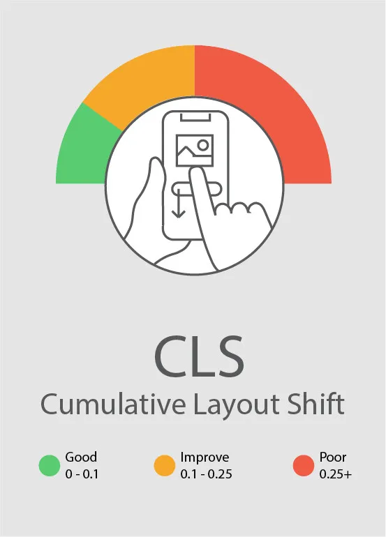
Cumulative Layout Shift (CLS)
When browsing a website or reading an article online, nothing is worse than the site’s layout shifting dramatically and losing your place. Or even worse, it shifting so much that you click the wrong button or accidentally click an ad that takes you off site. Cumulative Layout Shift is a metric that essentially measures how much elements shift about on a web page during loading.
How do I measure my website’s visual stability?
To measure a website’s visual stability, the Cumulative Layout Shift (CLS) metric measures how often layout shifts are occurring for real users. CLS measures the total sum of all layout shift scores for every unexpected layout shift that occurs on page – essentially, it measures how much the elements on page are moving.
How do I improve my website’s responsiveness?
Google recommends that sites should aim to maintain a CLS of less than 0.1.
Actionable Tips*
- Build your structure with HTML instead of building with JavaScript (in certain circumstances).
- Make sure you are loading images into structures that already exist – e.g. ghost loading.
- Anything that does need to layout shift, ensure this happens as fast and efficiently as possible.
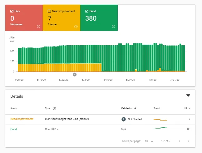
Measuring and Monitoring Core Web Vitals in Search Console
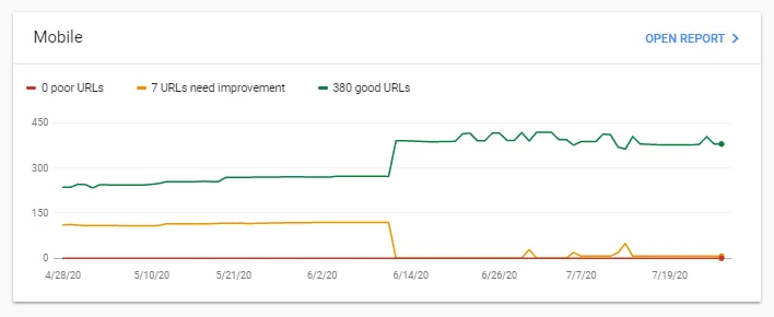
In light of the upcoming Page Experience algorithm update, Google Search Console have recently added a new report for webmasters to monitor and identify where improvements are needed for Core Web Vitals.
In essence, Google has given you the tools now to prepare – so you can’t say they didn’t warn you!
This report covers LCP, FID and CLS, and is structured in typical Search Console format – red for areas that need urgent attention through to green. The report will allow you to identify and prioritise actions for both mobile and desktop devices with example URLs of where the instances are occurring.
Mobile Friendliness
Since mid-2019, mobile-first indexing is enabled by default for all new websites. This means that Google will predominantly use the mobile version of your website’s content for indexing and ranking in the search results.
The need for a mobile-friendly and responsive website is nothing new. By now, most website owners have achieved this, after the Mobile Friendly algorithm was released in 2015. However, there’s a possibility some businesses haven’t – or haven’t monitored their site’s friendliness in a while. Users don’t want to pinch and zoom around your website on a small screen, and Google knows this – so will place a competitor with a mobile-friendly site above yours.
How do I test if my website is mobile-friendly?
The easiest way to test if your website is mobile-friendly is to use Google’s mobile friendliness tool. However, this will only measure individual pages at a time, so we would recommend looking at your homepage, a sample service/product page, and any post pages (e.g. blog posts) for a quick overview.
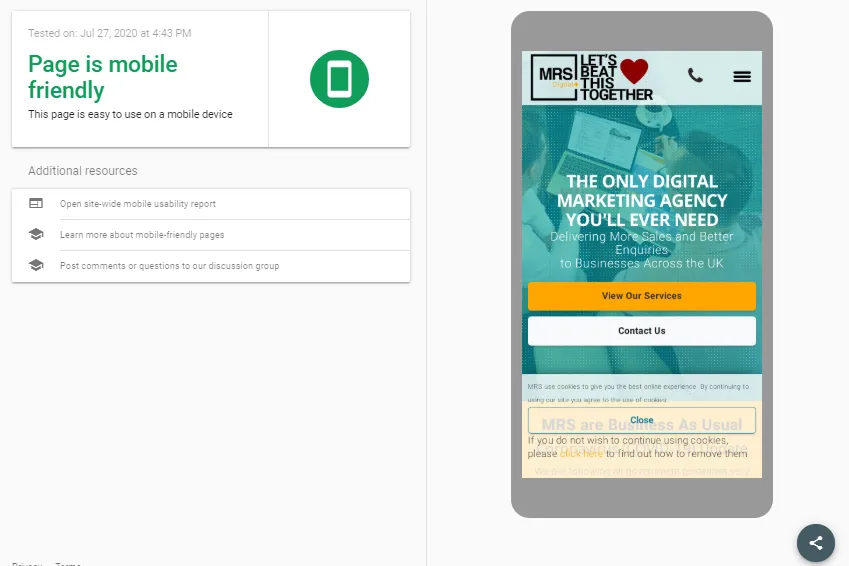
For a broader look at your entire website, we would recommend using Google Search Console’s mobile usability report. This will break down the mobile-friendly ‘valid’ pages on your site, as well as highlight any errors that are preventing a page/pages on your site from being recognised as mobile-friendly.
This includes issues such as:
- Clickable elements being too close together
- Text being too small
- Content being wider than the screen
- Viewport not set
- Viewport not set to “device-width”
- Uses incompatible plugins such as Flash
How Do I Make My Website Mobile Friendly?
This entirely depends on the resources open to you because, essentially, you will need to organise existing sections of content into a mobile-friendly design pattern – making it responsive.
Depending on how old your website is, it may end up being more sensible for you to start from scratch rather than modify what you are currently working with. Your best bet is to ask a developer you trust – you need someone honest who will be able to devise the best plan of action.
You might be surprised at what you can do with your current site. However, if your website is built with Flash or is using outdated e-commerce platforms, you will almost certainly need to start again (sorry!).
If rebuilding from the ground up, you can save money by selecting a responsive theme or template and reusing existing content. However, mobile-friendliness is always worth the investment – as Google puts it:
“In many countries, the number of smartphones has surpassed the number of personal computers; having a mobile-friendly website has become a critical part of having an online presence.”
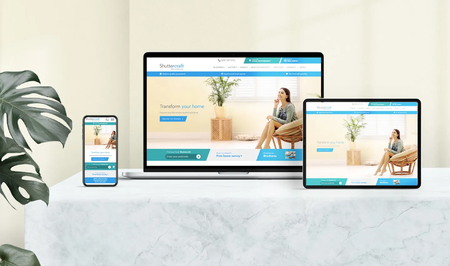
Need help making your website mobile-friendly? We can help. Here’s one we made earlier…
HTTPS
The Secure HyperText Transfer Protocol or HTTPS is the secure padlock you see next to a website’s URL in most browsers.
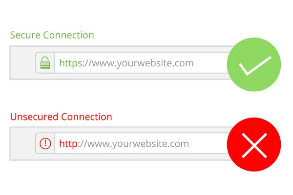
When a web page is served over HTTPS, it encrypts HTTP requests and responses so that an intercepting attacker only sees encrypted characters when trying to get hold of personal information. This is obviously a massive trust factor and benefit for users on a website. When you land on a website that doesn’t use HTTPS, you get a ‘Not Secure’ message in the URL bar – which can put people off making a purchase or communicating with your site.
HTTPS is, in our eyes, an absolute must (!). It should be a basic requirement of any website. Your users should be able to visit your site and feel safe in the knowledge that their personal information is protected.
If you are not yet using HTTPS, we would strongly recommend getting it implemented. With the upcoming algorithm update, this is likely to be a more heavily weighted ranking factor.
Intrusive Interstitials
This all boils down to ensuring content is easily accessible to users. Intrusive pop-ups and interstitials can impact accessibility to content when they block a large quantity, or all of the content on-page. Google included guidelines surrounding this back in 2017, but it looks as if this will once again factor into the upcoming algorithm update.
According to Google’s guidelines, banners and pop-ups can be used if they:
- Cover cookie usage or age verification
- Are login dialogs
- Are small banners that are easily dismissible
So, it may be worth reconsidering that large pop-up on the homepage come 2021…
How Much Will the Page Experience Update Impact Search Results?
Unfortunately, no one really knows. We’ll have to wait and see how much it impacts visibility and rankings in search as and when the update goes live. However, as Google has given us the measurement tools needed, and a pre-warning of the algorithm taking place, we would say the likelihood is that the impact will be noticeable.
How Else Can You do to Improve Page Experience?
We’ve known for a long time that Google takes user behaviour into account when it comes to SEO. So, in addition to what they’ve documented for improvement in time for next year, we’ve included some additional factors to take into consideration. They include:
Page Break
Look to Increase Dwell Time
Dwell time is the time interval between a user clicking on a search result to consume content on your website before returning to the search results or performing another action on site. It is essentially a metric that indicates how well your website’s content satisfies your users’ queries.
Whilst it’s not an official ranking factor, many people believe that dwell time influences search rankings. And why wouldn’t it? If users are staying on your site longer, your website is doing something right.
To improve dwell time, you should look to:
- Give a great first impression through
- Page loading speed (less than 3 seconds)
- Web design and layout that denotes trust
- Remove annoying pop-ups and ads that can irritate users
- Easy to read (mobile-friendly) and digestible content
- Encourage conversation through a comment section (if applicable)
- Include up to date, unique and insightful content
- Make sure your content is specific to what users actually want to see
- Include engaging multimedia – imagery, infographics and video
- Add internal links
Create Seamless Journeys
Fix Broken Links
Making sure there are no empty or broken links in your menus and buttons will mean your visitors can continue travelling throughout your website without interruption or dead-ends. Use a site auditing tool to highlight links that point to 404 (not found) pages and amend where necessary.
Add Breadcrumbs
Adding breadcrumbs to your website can reduce bounce rate and offer an alternative way for your users to navigate throughout your site – i.e. going back a step or a couple of steps.
Showcase Related Content
Make sure you’re highlighting related content to encourage further click through into your site – this will increase visitor time.
Page Experience Checklist
Access your Core Web Vitals report and mobile friendliness report on Google Search Console – these are the metrics you are looking for:
- Largest Contentful Paint occurs within the first 2.5 seconds of a page load
- First Input Delay of less than 100 milliseconds
- Cumulative Layout Shift of less than 0.1
Other Considerations:
- Website mobile-friendly
- Mobile usability errors fixed
- HTTPS implemented
- Intrusive interstitials and pop-ups removed
- Feature engaging multimedia
- Include useful, insightful content
- Good content readability scores
- Broken and empty internal links fixed
- Breadcrumbs added to site
* Actionable Tips & Our Checklist – Proceed With Caution
Please note that whilst we have presented this guide with actionable tips and a checklist, Page Experience updates require a flexible approach. It’s advised to work with a trusted team and a developer who can outline what is achievable and the best course of action to take depending on your circumstances.
Need Help Improving Your Website’s Page Experience?
MRS have been designing, building and optimising websites with users in mind for more than 20 years. Our experts are here to do the hard work for you, whether it be rebuilding your website so it’s fit for mobile, or improving overall performance. Speak to us today.


![How to Prepare for the Google Page Experience Update in 2021 [+ Checklist]](https://mrs.digital/wp-content/picasso/2025/06/S_DD_Logo_ReversedRGB_.webp)